Button
Buttons allow users to take action, make choices, and move forward. They can navigate to other pages and complete actions like making purchases or submitting forms.
Anatomy
A basic button typically has either a single label or icon. However, it can also be customized to include a label along with both a leading and trailing icon.
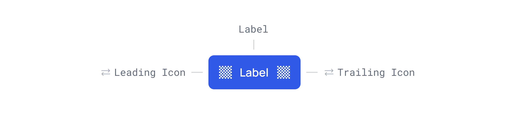 Button anatomy.
Variants
Each button variant has a particular function and its design signals that function to the user. It is therefore very important that the different variants are implemented consistently across products, so that they message the correct actions.
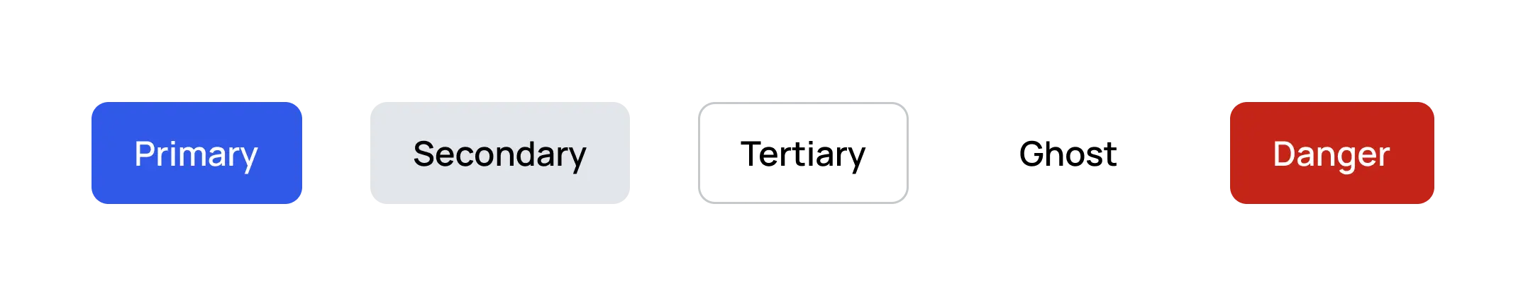 Button variants.
Primary
The main call to action on the page should have one primary button per screen, except in the application header or modal dialog.
 Primary button.
Secondary
The secondary button is like a middle option between the primary and tertiary buttons. It's handy when a button needs a bit more attention than a less important one, like the 'Next' button in an onboarding process.
 Primary and Secondary buttons.
Tertiary
Tertiary buttons contain actions that are important but aren't the primary action. They pair with the primary button to indicate an alternative, secondary action.
 Tertiary and Primary buttons.
Ghost
Ghost buttons are for less important actions. In a progress flow, they might accompany primary and secondary buttons, with the primary for moving forward, the secondary for 'Back', and the ghost button for 'Cancel'.
 Ghost, Secondary, and Primary buttons.
Danger
For actions that may result in the loss of user data, such as delete or remove.
 Danger button.
Emphasis
Button hierarchy emphasizes which button is more important in the context so the user can take action immediately.
Buttons use color and contrast to create three levels of emphasis and hierarchy.
Buttons with the strongest emphasis are primary, followed by secondary, then tertiary and ghost.
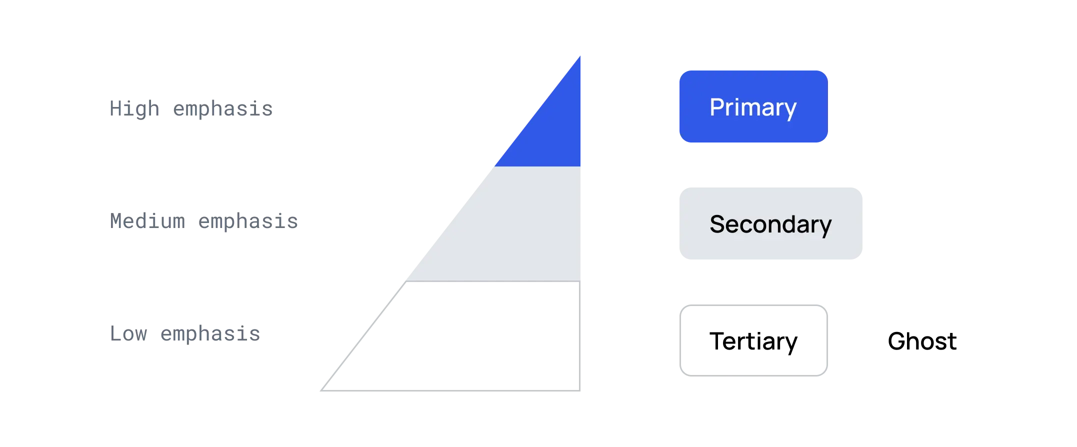 Button emphasis.
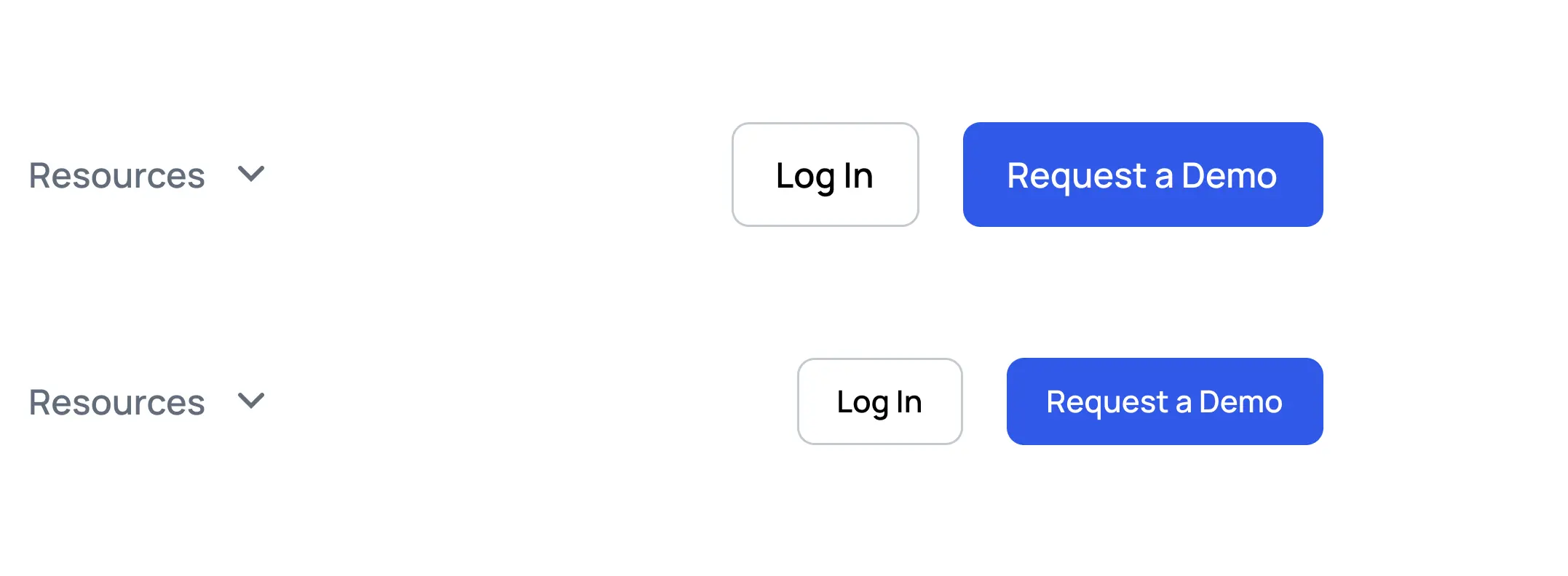
Sizes
In the design system, it's crucial to offer various button sizes to accommodate different usage scenarios.
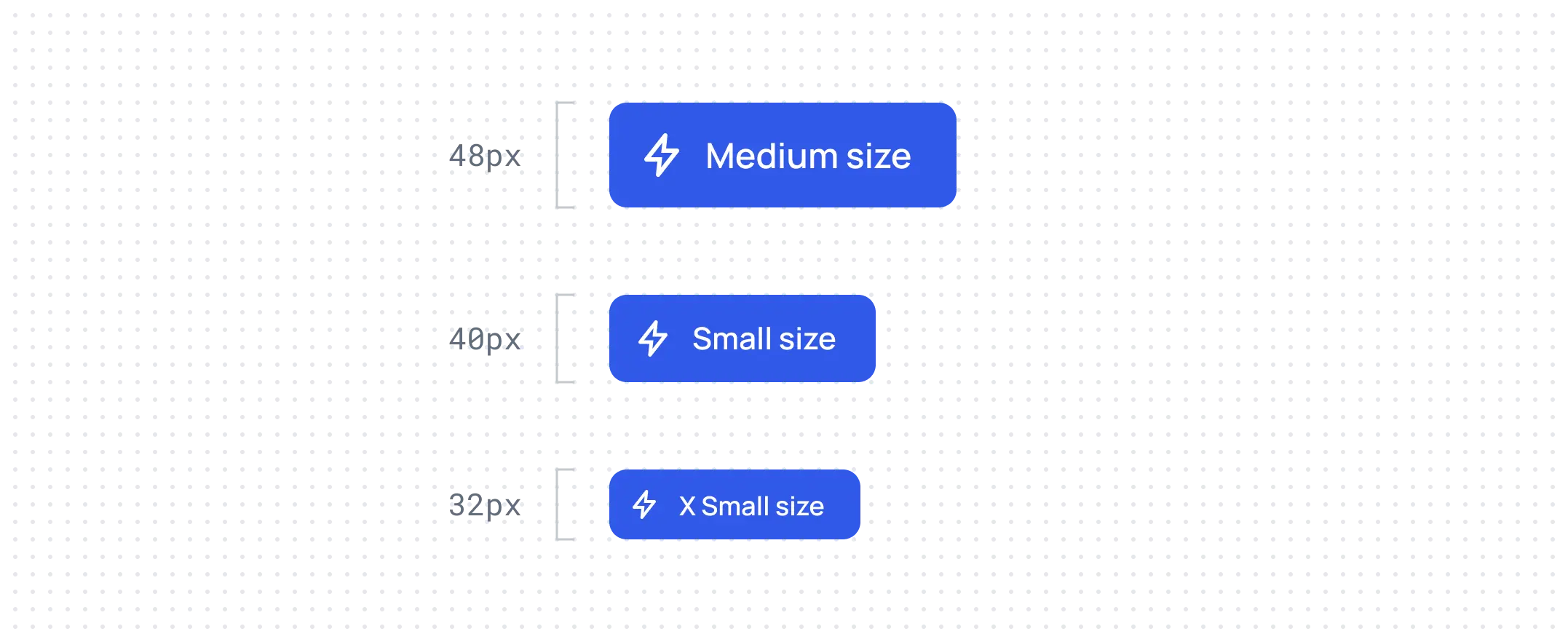 Button sizes.
Sometimes, when the block is small, it's necessary to use a button size that complements it well. For instance, this applies to header navigation.
States
States communicate the status of a button to the user.
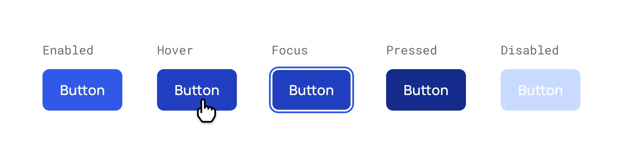
Enabled: An enabled state communicates an interactive component or element.
Hover: A hover state communicates when a user has placed a cursor above an interactive element.
Focus: A focus state indicates when a user has selected or highlighted an element using an input method such as a keyboard or voice.
Pressed: A pressed state indicates when a user has tapped on an element.
Disabled: A disabled state communicates a noninteractive component or element.


