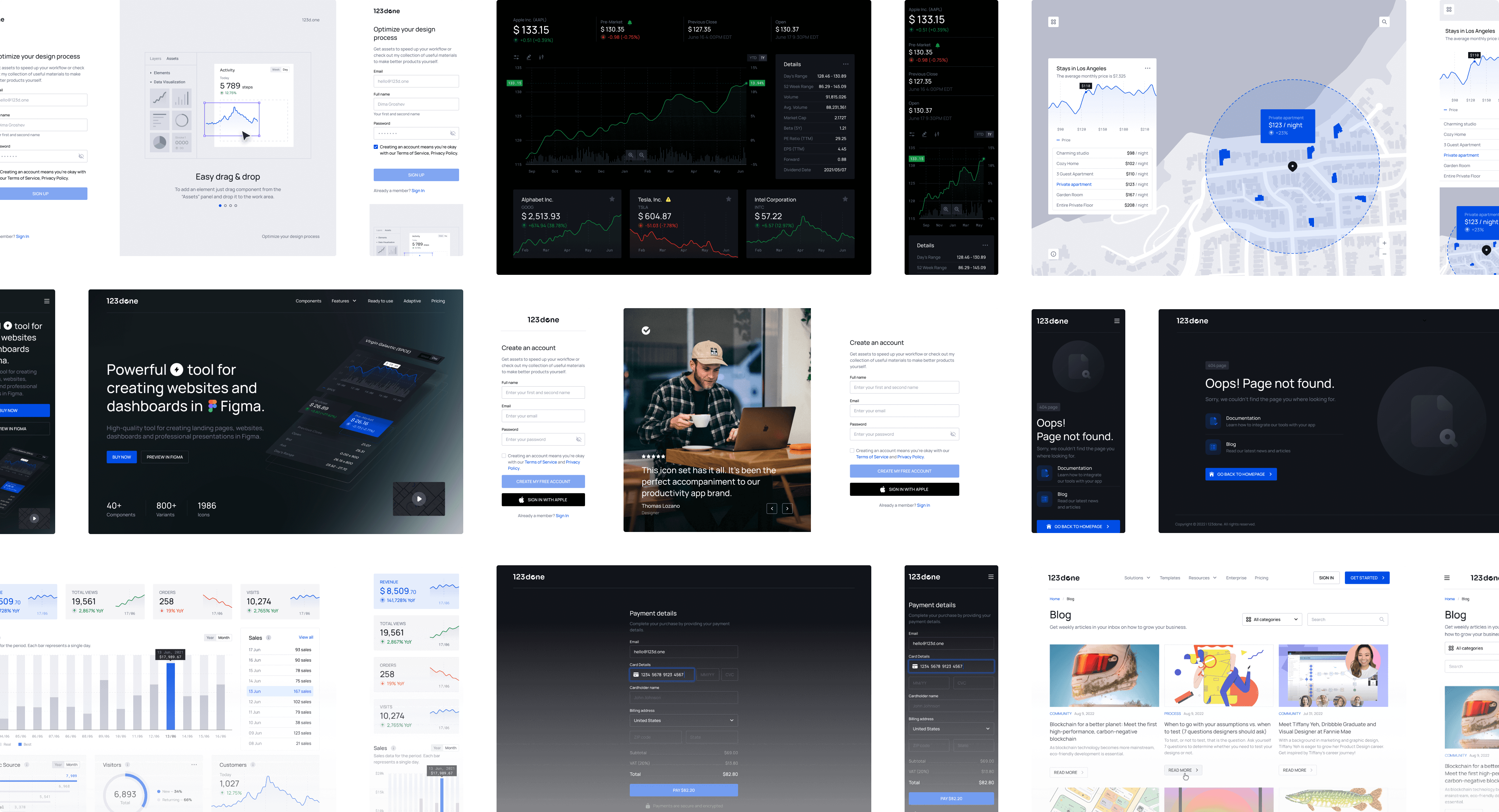
Powerful Figma Design System for creating websites
Universal Design System is a powerful tool for creating landing pages, websites and dashboards in Figma.
Components
35+
Sections
100+
Templates
50+
Everything you need to design interfaces in Figma, all in one place.
Unlock limitless possibilities for your design process.

Pre-made Templates
A wide range of templates to fulfill your specific requirements.

Ready-made Sections
Speed up your work with ready-made sections for building interfaces.

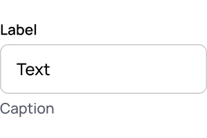
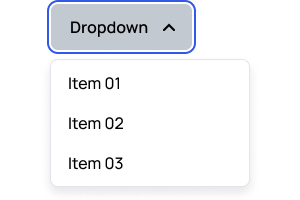
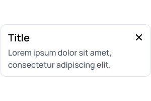
UI Kit components
Highly effective UI Kit components for creating landing pages, websites, and dashboards in Figma.

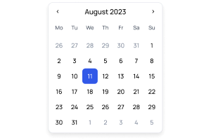
Data Viz components
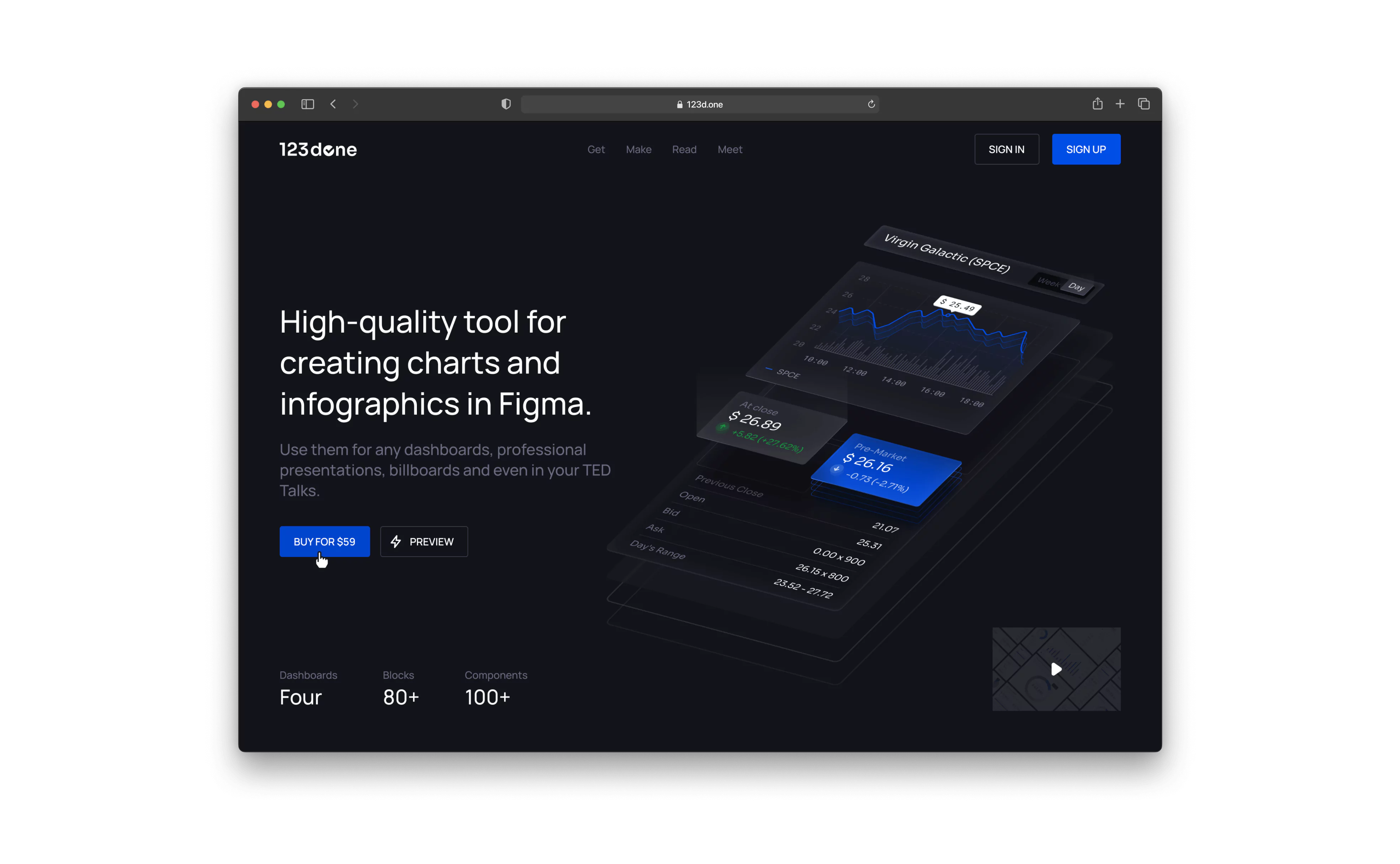
High-quality components for creating charts and infographics in Figma.

High quality Icons
High-quality icon set for websites, apps, social networks, prints.
From creation to presentation
Design like never before. 10x faster
Have a fresh look on the design process and make your work much easier.

Getting started is easy
Drag and drop the component or section you need from an extensive library, or start with a ready-made template.
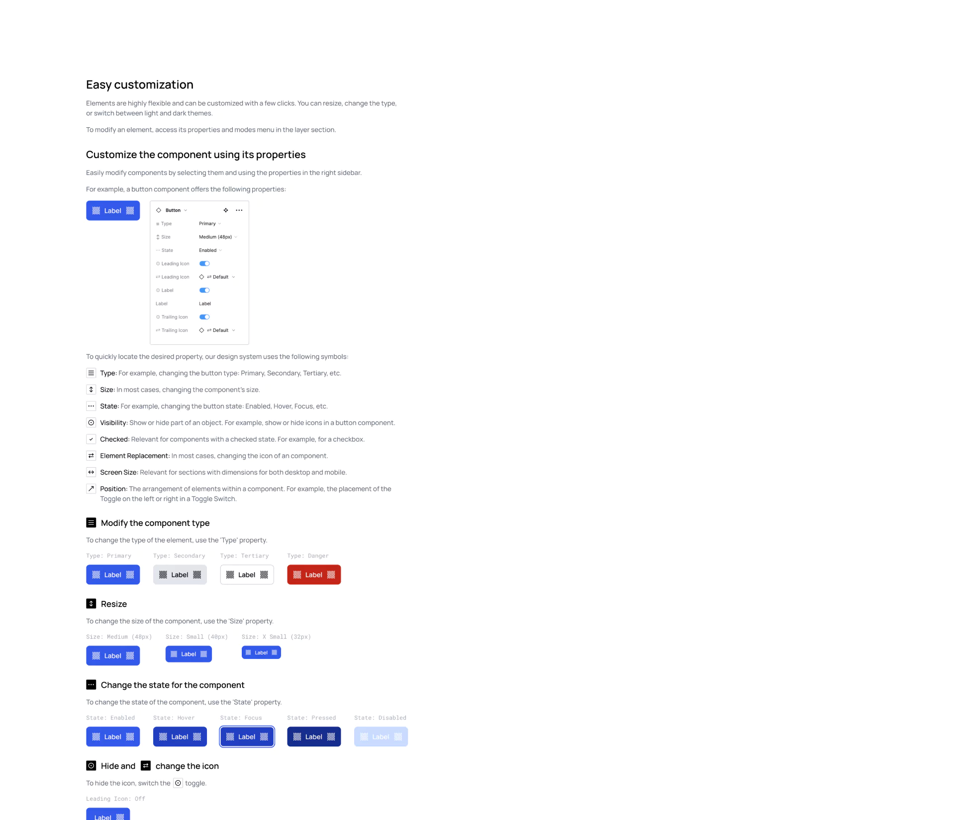
Flexible customization
Customize components or sections to fit your needs. Just a few clicks to resize, change type or switch to a dark theme.

Present like a Pro
All the components are interactive, making your prototype look dynamic and similar to the final product.
Everything you need for a quick start
Start your project by choosing from a wide range of components, sections, or ready-made templates. Simply drag and drop the selected component into your working area.
Get an easy start with our extensive templates library
Our library offers a wide variety of templates to meet your specific needs.
View all templates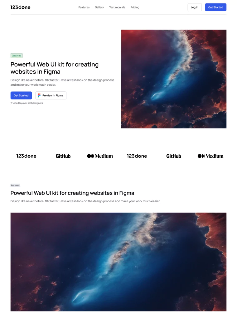

Get started with the ready-made sections
Speed up your work by using pre-made sections and blocks to build the interface.
Preview in FigmaElevate your projects with our extensive components library
Our UI Kit library offers a wide range of customizable components to suit various needs.
Detailed description
Attention to details


Build your project on a solid foundation
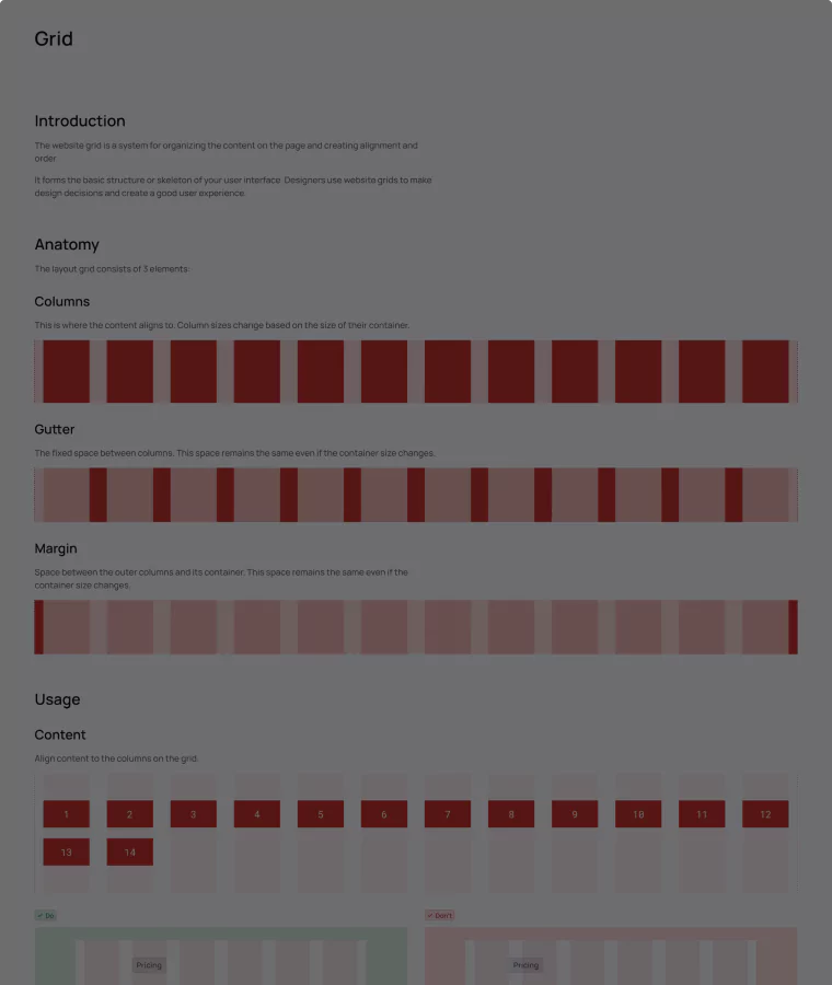
Thanks to a foundation with grids for different screens, colors, and fonts, it's easy to keep a consistent style in all your layouts.
Begin easily with a "How to Use" guide and step-by-step tutorials
Get started without any difficulty by using a user-friendly "How to Use" guide that provides clear instructions, and then proceed with step-by-step tutorials to help you learn more effectively.
Start creating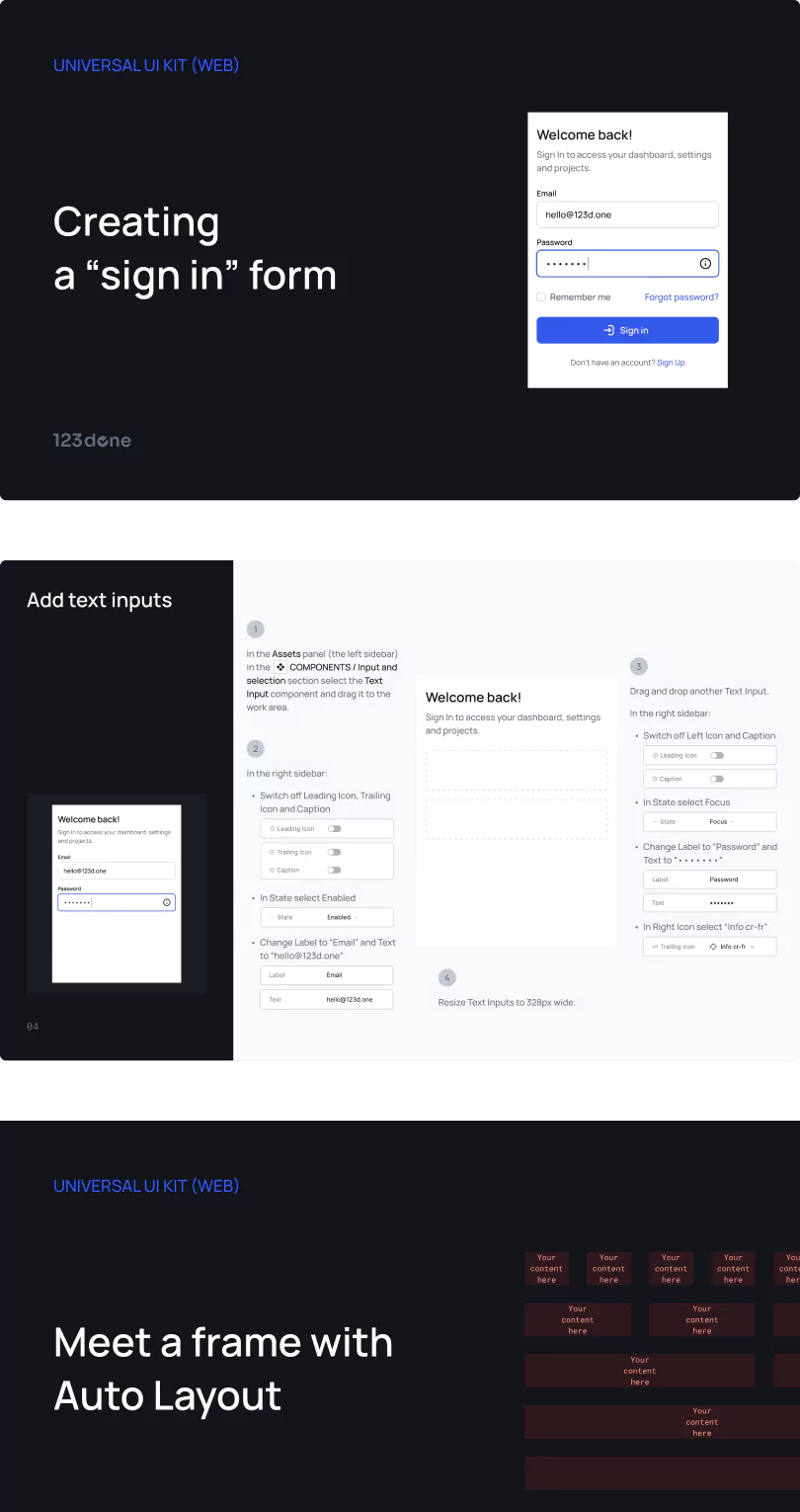
Flexible customization
Customizing components and sections has never been easier and more flexible.
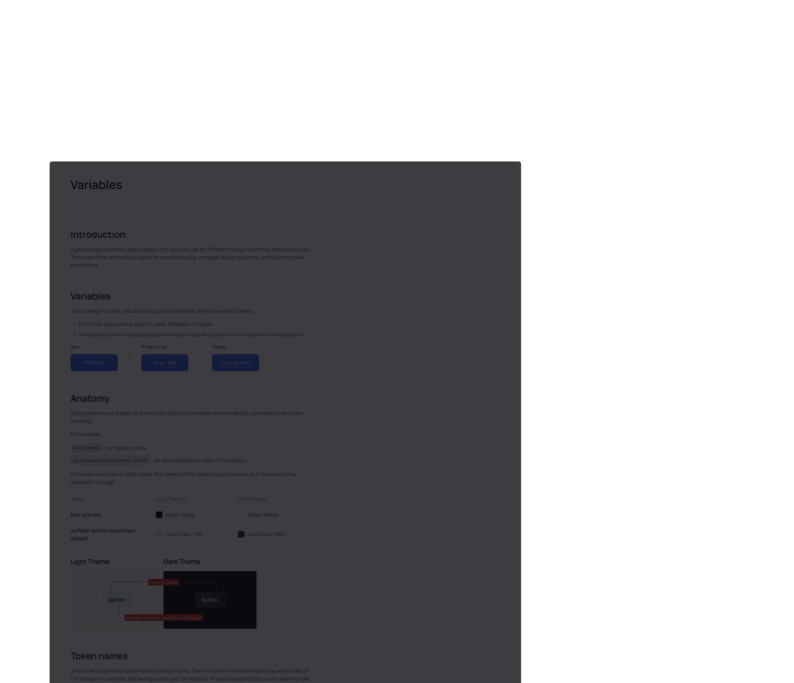
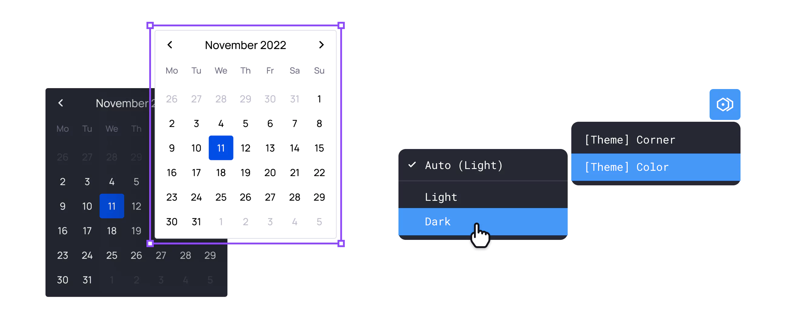
Variables
Thanks to Figma variables, you can save time and make it easier to manage the design system.
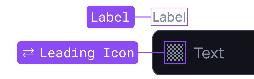
Universal components
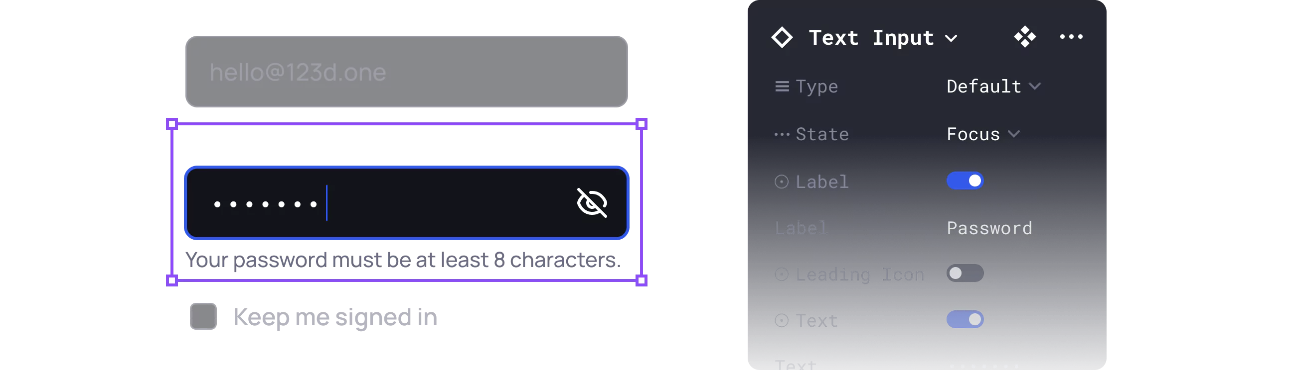
Our components are easily customizable to fit your needs. With just one click, you can resize, change their type, states, and hide one or more elements.
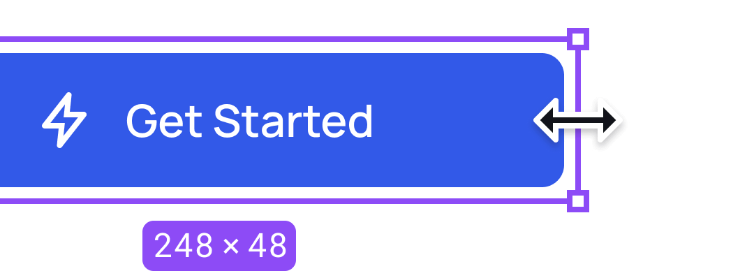
Responsive components
All the components are based on Auto Layout, so they can be easily adjusted to any interface size.
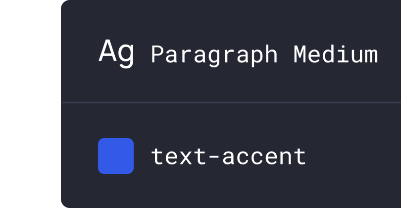
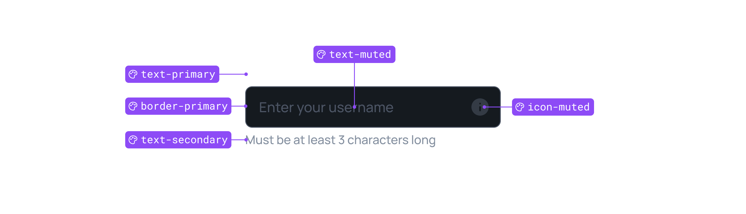
Global styles
Thanks to a unified foundation, you can easily change fonts and colors to your own.
Dark and light theme
A single click is all you need to switch elements and sections from light to dark themes and vice versa.
Present like a Pro
Make your prototype look dynamic and similar to the final product.
Interactions
All components are interactive, making your prototype look like the final product.
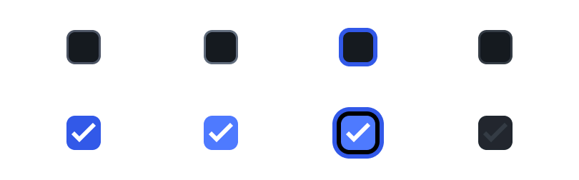
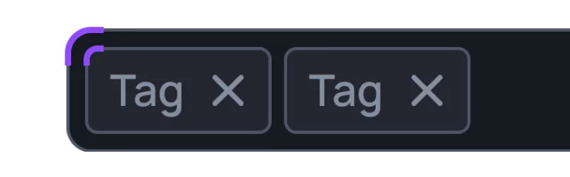
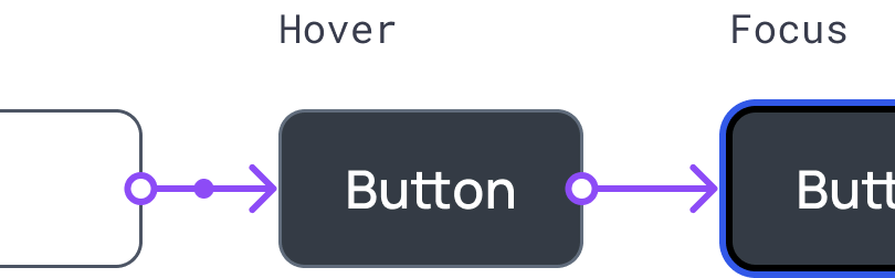
Component states
All components have various states. Hover or click to see the result.
Smooth animation
We ensured smooth animations during interactions.
All in one file
Experience unlimited design power with our Figma file that is well-organized and easy to access, anytime and anywhere.
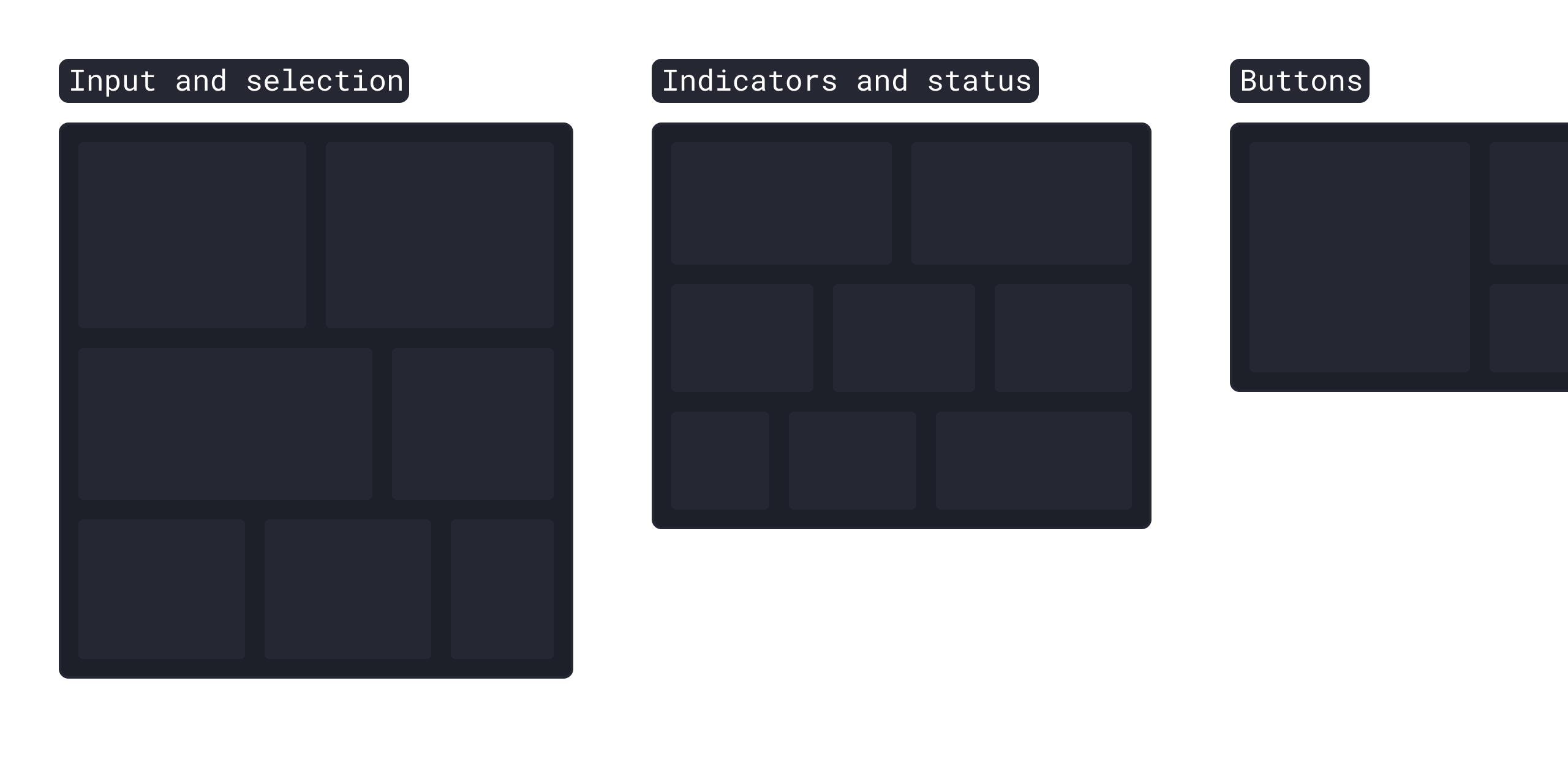
500+ variants of 25 UI Kit components
500+ variants of 25 UI Kit components
100+ variants of 9 Data Visualization components
2 724 high-quality vector icons (908 icons x 3 styles)
2 724 high-quality vector icons (908 icons x 3 styles)
Ready-made Sections
Pre-made Templates
Pre-made Templates
Getting Started (Guide)
Compact view
The file structure is simple and easy to start working with it.
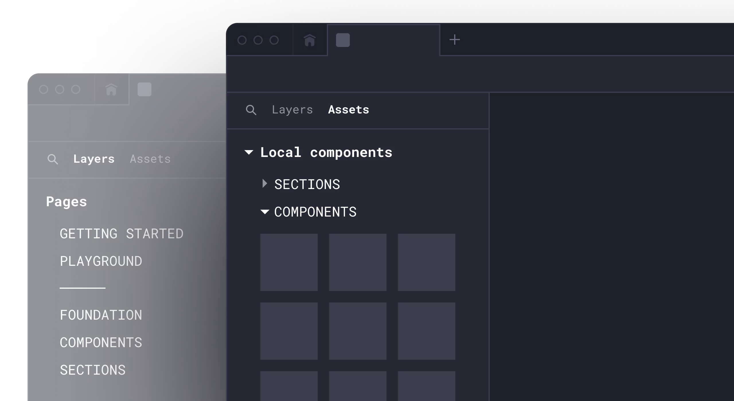
Organized by categories
The assets are organized in a structured system, allowing you to quickly find the elements you need.
Unlimited power
Create stunning landing pages, websites, and dashboards with ease using the powerful Universal Design System tool in Figma.
Get Universal Design System
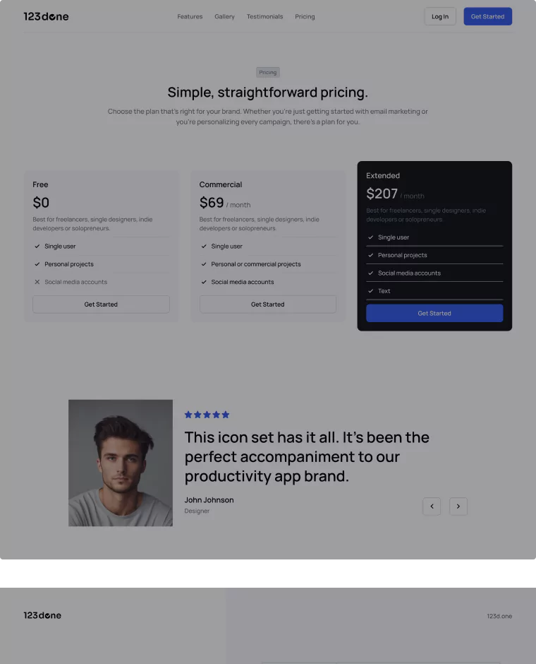
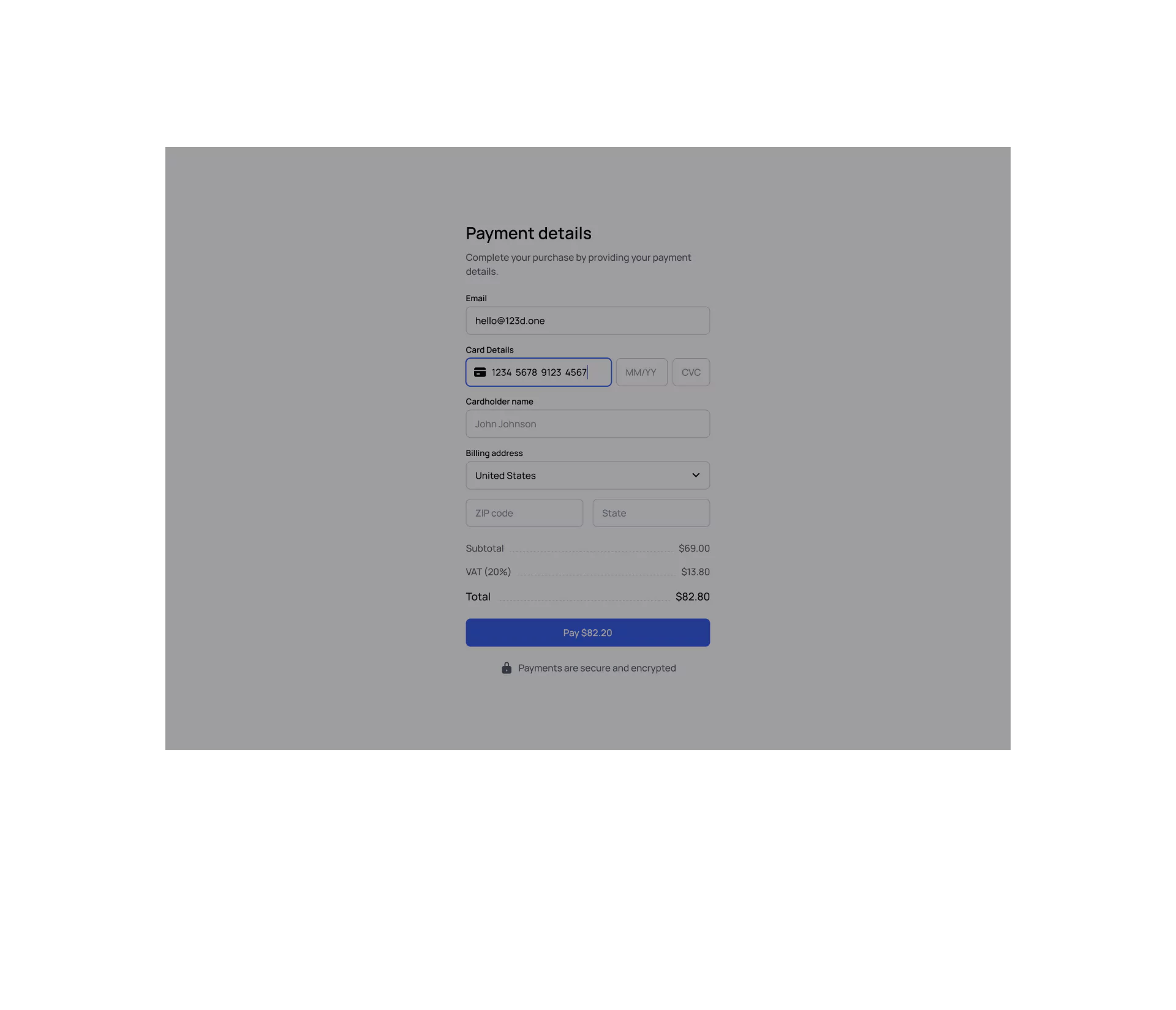
Projects require different types of licenses. Choose your one.
1 year of updates
Perfect for solo designers, developers, creators and freelancers.
$227 $149
Then $69/year • Cancel anytime
Buy now- Single user license
- 1 year of free updates
- Personal or commercial projects
Lifetime updates
Perfect for solo designers, developers, creators and freelancers.
$307 $229
One-time payment
Buy now- Single user license
- Lifetime free updates
- Personal or commercial projects
Custom service
Custom Figma Design System based on the Universal Design System.
$5,999
3-4 weeks for development
Contact us- We'll create a custom Figma Design System for your project based on the Universal Design System and your instructions
- Up to 20 users
- Personal or commercial projects
1 year of updates
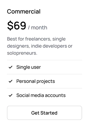
Best for startups, teams, business or enterprise organisations.
$681 $447
Then $217/year • Cancel anytime
Buy now- Up to 20 users
- 1 year of free updates
- Personal or commercial projects
Lifetime updates
Best for startups, teams, business or enterprise organisations.
$921 $667
One-time payment
Buy now- Up to 20 users
- Lifetime free updates
- Personal or commercial projects
Custom service
Custom Figma Design System based on the Universal Design System.
$5,999
3-4 weeks for development
Contact us- We'll create a custom Figma Design System for your project based on the Universal Design System and your instructions
- Up to 20 users
- Personal or commercial projects
Safety payments provided by Lemon Squeezy.
5.0
5.0
Info
| Version | 25.05.12 |
|---|---|
| Format | Figma, IconJar, SVG |
| Last update | May 12, 2025 |
Features
- All shapes are vector based
- Easy to change (Support Figma's Variants)
- Easy to change color and font
Updates
v25.05.12 (May 12, 2025)
Typography Variables and new Templates
v24.03.12 (Mar 12, 2024)
Added the Keyboard Icon Set and new Icons
Need help?
Here are answers to our most frequently asked questions.
The subscription is required if you want to receive product updates.
Yes, of course, you can cancel your subscription at any time.
Yes, of course, you will be able to use the products for personal and commercial projects after your subscription ends.
If you purchased through Lemon Squeezy:
- From your My Orders page if you made an account.
- By clicking ”Download” button in your original purchase email. These are sent from hello@lemonsqueezy-mail.com with the subject ”You purchased …”
If you purchased through Gumroad:
- From your Gumroad Library if you have made an account.
- By clicking the “View content” button in your original purchase email. These are sent from noreply@customers.gumroad.com with the subject “You bought ...”
Figma's Starter plan is 100% free for individuals. If you want to use more advanced features such as team libraries, dev mode, or multiple variable modes, you'll need to purchase a Professional plan.
If you have any questions or require additional information, please do not hesitate to contact us. We welcome your feedback about the product at hello@123d.one
We also recommend checking Figma's Help Center for the best tutorials on more advanced features, such as components, variants, auto layout, interactive components, and component properties.
We use Lemon Squeezy and Gumroad to handle the payment process. They use secure SSL encryption, so you're very safe!
Yes, of course. We'll discount the amount you've paid for the commercial license. Just send us an email at hello@123d.one
Yes, certainly. We will discount the amount you've already paid for the product (UI Kit, Icon Set, or Data Visualization) that is included in the Universal Design System. Please send us an email at hello@123d.one
If you purchased through Lemon Squeezy:
- From your My Orders page if you made an account. Just click the ”Generate Invoice” button.
- By clicking ”Generate” link in your original purchase email. These are sent from hello@lemonsqueezy-mail.com with the subject ”You purchased …”
If you purchased through Gumroad:
- By clicking the ”Generate” button on your receipt from Gumroad after your purchase.
You can use our products for any commercial project. Feel free to create unlimited designs for clients and charge for your services.
But please note that you can't use it to create another UI Kit, icon set, theme, or template, even if it's not in Figma. Be sure to review our License Agreement before purchasing.
We offer a 50% student discount. Please email us at hello@123d.one before making your purchase, and make sure to use your student email or attach valid student ID/proof.
We typically respond within 2 business days, but it may take up to a week in some cases. If you haven't found our email in your inbox, please check your junk mail folder and ensure that hello@123d.one is added to your White List or Safe Sender List.
If you still haven’t received an email, reach out to us on Instagram or X (Twitter).
We will do our best to answer your request as soon as possible.
Products
Components
Library
123done
Get in touch


Copyright © 2026 | 123done. All rights reserved.